Why text expansion breaks your UI and how to fix it

You build a clean UI in English. Buttons fit their labels. Navigation items sit neatly in a row. Cards display their content without truncation. Then you add German, and the layout falls apart.
Text expansion is the increase in string length that happens when you translate from English into other languages. It is one of the most common and most overlooked localization problems. Unlike missing translations or wrong formats, expansion issues are invisible until you actually switch the locale. By that point, they have usually reached users.
This post covers why expansion happens, how much to expect per language, and the specific CSS and design patterns that prevent it.
This is part of our complete technical guide to internationalization (i18n) and software localization. If you are working through the full localization setup, start there.
What is text expansion?
Text expansion is the difference in character count (and rendered width) between a source string and its translation.
English is a compact language. It uses short, uninflected words and borrows heavily from Latin and French without the grammatical apparatus those languages require. Most other languages produce longer strings for the same content.
A simple example:
| English | German | French | Finnish |
|---|---|---|---|
| Save changes | Änderungen speichern | Enregistrer les modifications | Tallenna muutokset |
| 12 chars | 22 chars | 30 chars | 18 chars |
| +0% | +83% | +150% | +50% |
The German translation is almost twice as long. The French is two and a half times the length. Both are completely normal.
The problem is not the translation. The problem is a UI designed around the assumption that English string lengths are representative.
How much expansion should you expect?
Expansion varies significantly by language pair and content type. Short strings expand more proportionally than long ones. UI labels, button text, and navigation items (exactly the most layout-sensitive content) tend to expand the most.
A rough reference by language family:
| Language | Typical expansion vs English |
|---|---|
| German | 20-35% |
| Finnish | 20-30% |
| Dutch | 15-25% |
Why the numbers don't always match the examples above.
The table shows average expansion across a full product's string set. Short strings like button labels and navigation items expand much more proportionally than longer content. A 2-word button might expand by 50-100%, while a paragraph might only expand by 10-15%. The "Save Changes" example earlier shows +50% for Finnish because it is a short string, exactly the kind of content where expansion hits hardest.
| Language | Typical expansion vs English |
|---|---|
| French | 15-25% |
| Spanish | 15-20% |
| Italian | 15-20% |
| Portuguese | 10-20% |
| Russian | 10-20% |
| Polish | 10-25% |
| Japanese | -10 to +10% (character-dense) |
| Chinese | -20 to -10% (character-dense) |
| Korean | 0 to +15% |
| Arabic | 15-25% (plus RTL layout impact) |
Note on Japanese and Chinese: These languages use logographic scripts where a single character conveys what English expresses in a word. Strings are often shorter in character count but can be taller, requiring line-height consideration.
The industry rule of thumb for UI design: build for strings up to twice the length of the English original. This is conservative for most languages but protects you against edge cases and compound words in German or Finnish.
Where expansion causes the most damage
Text expansion does not break everything equally. The worst-affected areas share one characteristic: fixed or constrained space.
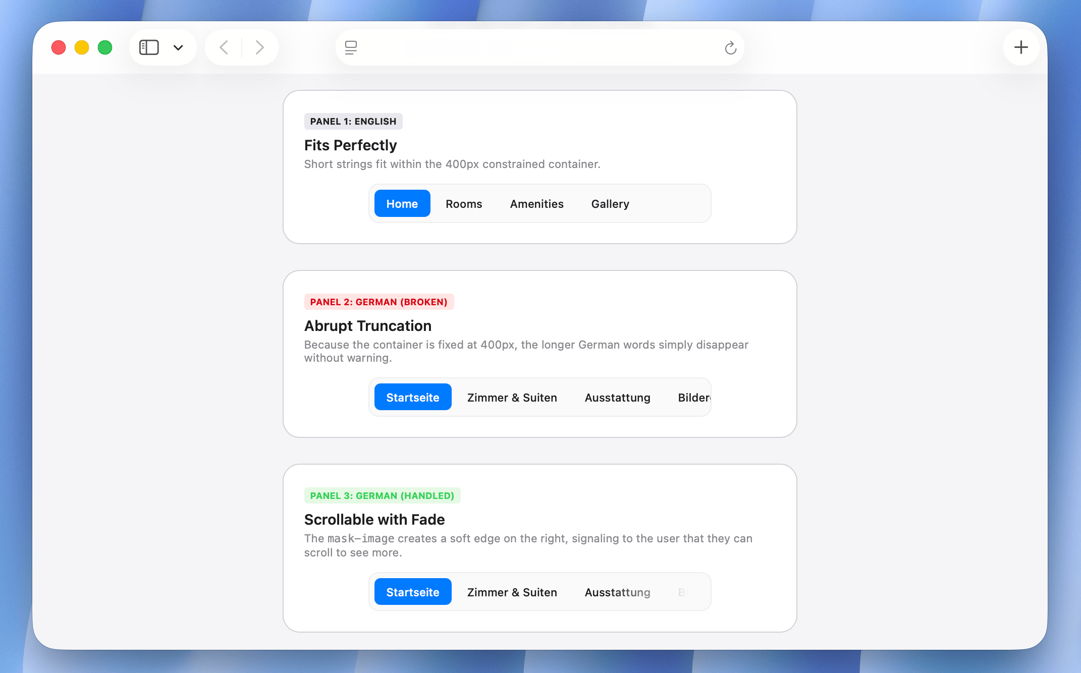
Navigation items
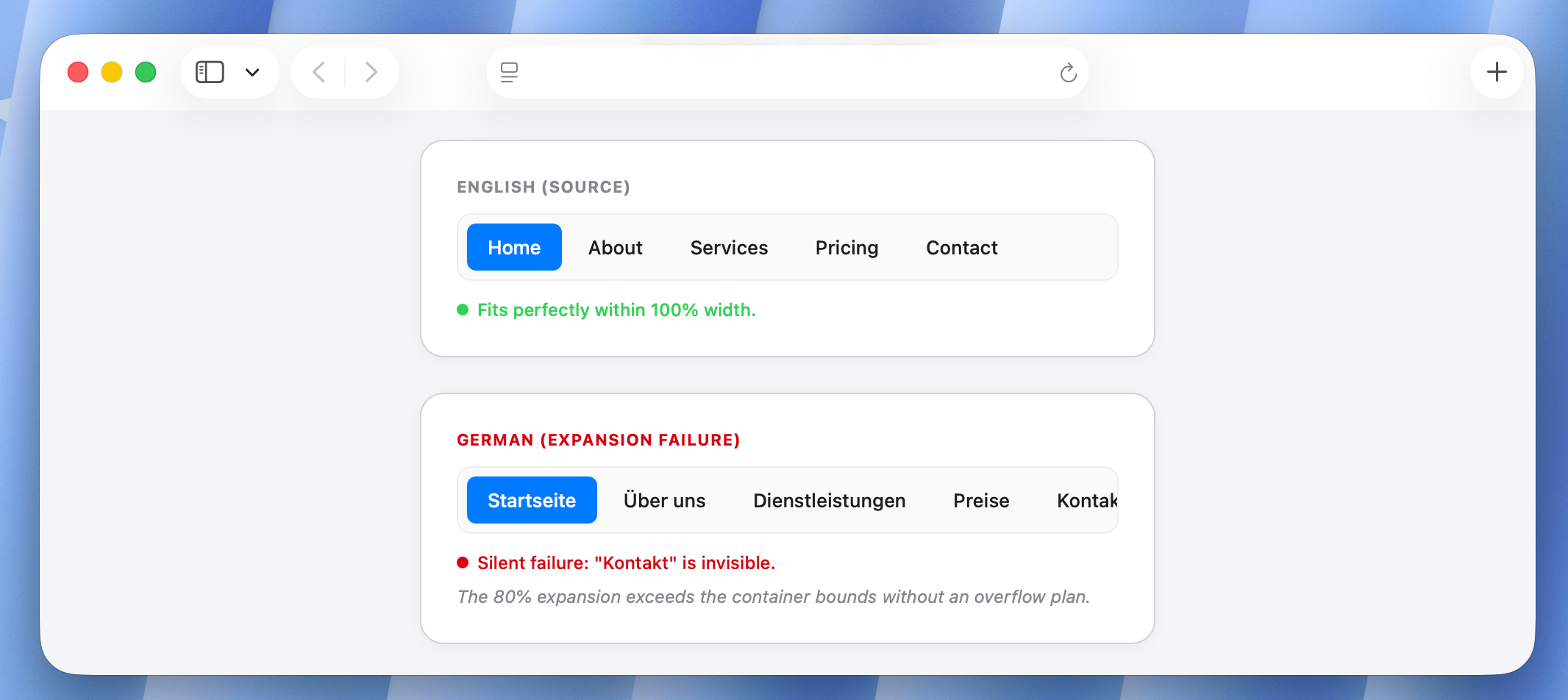
Horizontal navigation is the most common failure point. A nav bar with five items that fits perfectly in English can overflow, wrap, or truncate in German.
English:  | Home | About | Services | Pricing | Contact |
German:   | Startseite | Über uns | Dienstleistungen | Preise | Kontakt |
The German nav is roughly 80% longer. If the container is width: 100% with overflow: hidden or white-space: nowrap, some items disappear entirely.
Buttons
Button text that overflows becomes either truncated (invisible label), wraps onto a second line (unexpected height), or pushes adjacent content out of position (broken grid).
// This button works in English and breaks in German
<button style={{ width: 120, overflow: 'hidden', whiteSpace: 'nowrap' }}>
  {t('reservation.confirm')}
</button>

// English: "Confirm booking"     → 15 chars, fits
// German:  "Buchung bestätigen"  → 18 chars, truncated
The truncation is silent. A user sees "Buchung bestät..." and has no idea what the button does.
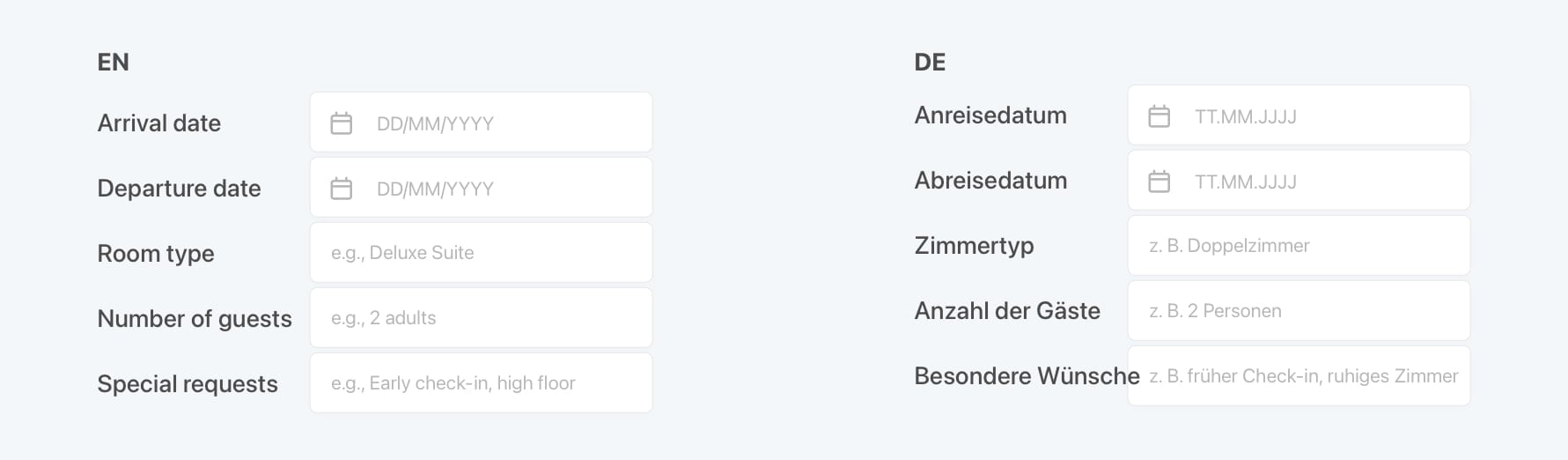
Form labels and field widths
Two-column form layouts often break under expansion. Labels that were designed to sit neatly beside their inputs wrap unexpectedly, shifting everything below.
A hotel check-in form in English:
Arrival date      [        ]
Departure date    [        ]
Room type         [        ]
Number of guests  [        ]
Special requests  [        ]
In German:
Anreisedatum            [        ]
Abreisedatum            [        ]
Zimmertyp               [        ]
Anzahl der Gäste        [        ]
Besondere Anforderungen [        ]
"Special requests" becomes "Besondere Anforderungen": 23 characters versus 16 or "Besondere Wünsche". If the label column has a fixed width, it wraps. If it has overflow: hidden, it truncates. Either way, the form breaks.
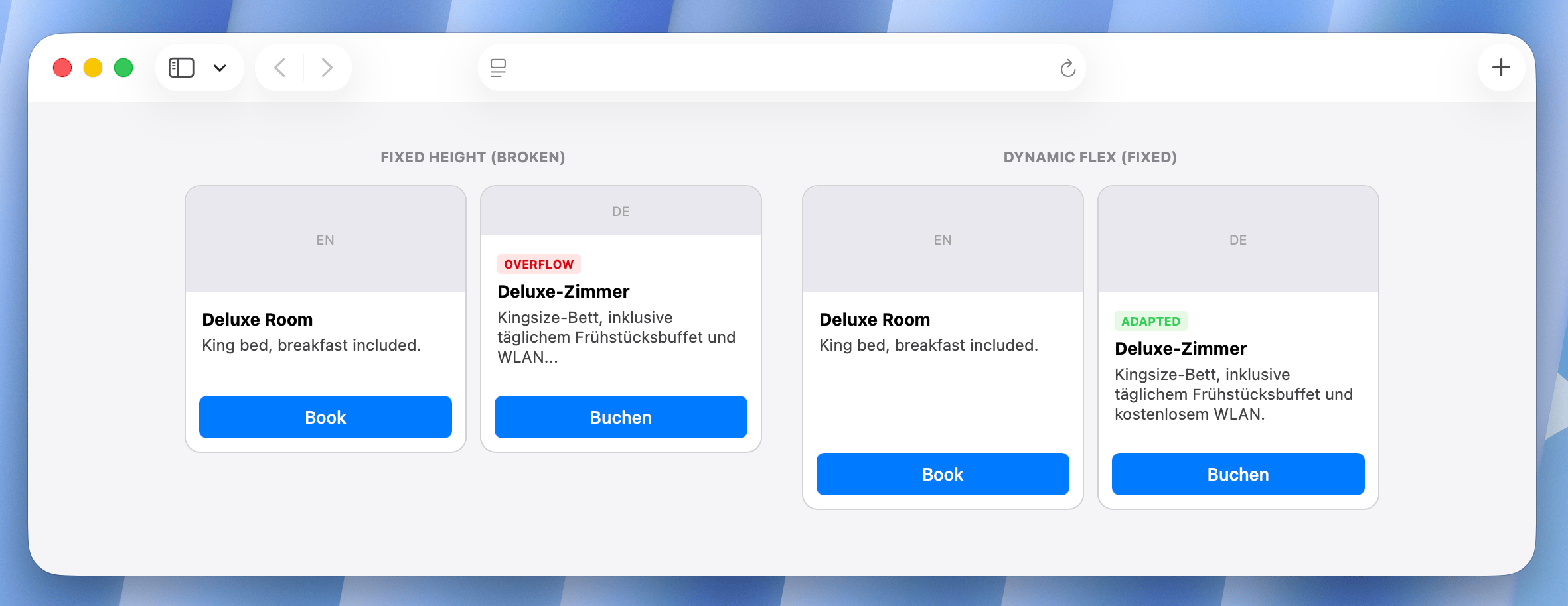
Card components and data tables
Cards with fixed heights and overflow: hidden are silent truncation traps. A room description that fits in three lines of English may need five in German.
┌─────────────────────────┐    ┌─────────────────────────┐
│ Deluxe Room             │    │ Deluxe-Zimmer           │
│ Sea view, king bed,     │    │ Meerblick, Kingsize-    │
│ breakfast included.     │    │ Bett, Frühstück         │
│ [Book now]              │    │ inklusive. [Jetzt       │
└─────────────────────────┘    │ buchen]                 │
   English (3 lines)           └─────────────────────────┘
                                 German (5 lines, overflows)
The card height in the English design is exact. There is no room for expansion.
Tab bars on mobile
Mobile tab bars are the most space-constrained navigation pattern. Five tabs on a 390px screen have about 78px each, enough for an icon and a short English label. "Reservations" in English is 12 characters. In German it is "Reservierungen" at 14. In French it becomes "Réservations" at 12, but with an accent that may require a different font rendering. In Finnish it is "Varaukset" at 9, which is actually fine.
The pattern that breaks: assuming English tab labels define the maximum width.
Diagnosing expansion issues early with pseudo-localization
The best time to catch expansion issues is before you have any real translations. Pseudo-localization replaces your English strings with padded, character-modified equivalents that simulate expansion without needing a translator.
"Confirm booking" → "[Cönfïrm böökïng xxxxxx]"
The brackets show the string boundaries. The accented characters test font coverage. The padding (xxx) simulates expansion. This can be run against your UI in CI before any translations exist.
A practical pseudo-localization rule: add 40% padding to each string.
function pseudoLocalize(str) {
  const expanded = str.replace(/[aeiou]/g, c => accentMap[c] || c);
  const padding = 'x'.repeat(Math.ceil(str.length * 0.4));
  return `[${expanded} ${padding}]`;
}
Run this against your translation files and test your UI. Every element that breaks with pseudo-localized content will also break with real translations.
Learn more: What is pseudo-localization? A practical guide for localization testing
CSS patterns that handle expansion correctly
The fix is not to make everything infinitely wide. It is to use flexible, resilient CSS patterns that adapt to content length instead of fighting it.
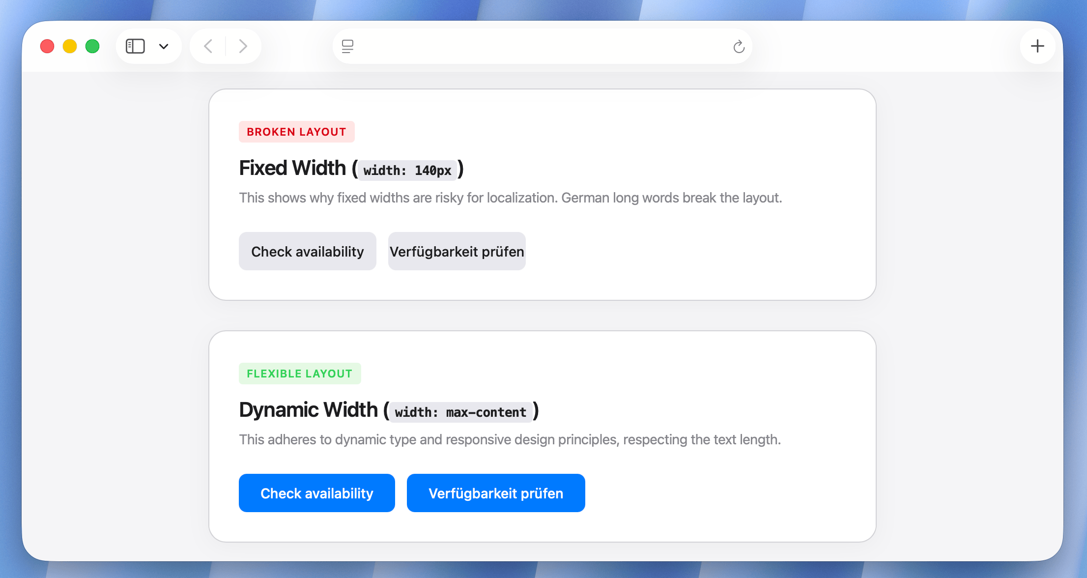
Use flexible button sizing
The most common button mistake is a fixed width.
/* Breaks under expansion */
.btn {
  width: 140px;
  overflow: hidden;
  white-space: nowrap;
}

/* Works under expansion */
.btn {
  min-width: 140px;      /* maintains a minimum size */
  width: max-content;    /* expands to fit content */
  max-width: 100%;       /* respects container */
  padding: 0.5rem 1.25rem;
  white-space: nowrap;
}
If you are working with button groups side by side, use flex-wrap: wrap on the container so buttons reflow onto a second line instead of overflowing.
.btn-group {
  display: flex;
  flex-wrap: wrap;
  gap: 0.5rem;
}
Use CSS logical properties and avoid hardcoded widths for labels
For form label/input layouts, use grid with max-content on the label column rather than a fixed pixel width.
/* Breaks when labels expand */
.form-row {
  display: grid;
  grid-template-columns: 160px 1fr;
}

/* Adapts to label length */
.form-row {
  display: grid;
  grid-template-columns: max-content 1fr;
  gap: 0 1rem;
}
With max-content, the label column grows to fit the longest label. The input column takes the remaining space. No truncation, no wrapping.
Allow text to wrap in cards
Card layouts almost always use overflow: hidden with a fixed height. The intent is a uniform grid. The result is truncated translations.
/* Truncates translated content */
.room-card {
  height: 220px;
  overflow: hidden;
}

/* Adapts to content */
.room-card {
  min-height: 220px;  /* establishes minimum, not maximum */
  height: auto;
}
If you need visual uniformity in a card grid, use align-items: stretch on the grid container and structure the card with flexbox internally so the action area (button) always stays at the bottom.
.card-grid {
  display: grid;
  grid-template-columns: repeat(auto-fill, minmax(280px, 1fr));
  align-items: stretch;
}

.room-card {
  display: flex;
  flex-direction: column;
}

.room-card__body {
  flex: 1; /* grows to fill available space */
}

.room-card__footer {
  margin-top: auto; /* pushes button to bottom regardless of content height */
}
Handle navigation overflow explicitly
For horizontal navigation, plan for overflow from the start rather than hoping translations fit.
Two solid patterns:
1. Scrollable nav with visual hint
.nav {
  display: flex;
  overflow-x: auto;
  scrollbar-width: none; /* hide scrollbar */
  -webkit-overflow-scrolling: touch;

  /* Fade at edges to hint at scrollability */
  -webkit-mask-image: linear-gradient(
    to right,
    transparent,
    black 5%,
    black 95%,
    transparent
  );
  mask-image: linear-gradient(
    to right,
    transparent,
    black 5%,
    black 95%,
    transparent
  );
}

.nav::-webkit-scrollbar {
  display: none;
}
2. Collapsing nav with overflow menu
More complex to implement but a better UX for desktop. Items that don't fit collapse into a "More" dropdown. This pattern requires JavaScript to measure items and move them dynamically.
function updateNavOverflow(navEl, moreEl) {
  const navWidth = navEl.offsetWidth;
  let totalWidth = 0;
  const items = [...navEl.querySelectorAll('.nav-item')];

  items.forEach(item => {
    totalWidth += item.offsetWidth;
    item.hidden = totalWidth > navWidth - moreEl.offsetWidth;
  });

  moreEl.hidden = items.every(item => !item.hidden);
}
Soft hyphenation for long words
German and Finnish compound nouns can be very long. "Reservierungsbestätigung" (reservation confirmation) is 24 characters. In a narrow column, it will overflow rather than wrap because there are no natural word break opportunities.
CSS provides two tools for this:
.translatable-content {
  /* Allow the browser to break words when necessary */
  overflow-wrap: break-word;

  /* Use language-aware hyphenation where supported */
  hyphens: auto;
}
hyphens: auto requires the lang attribute to be set on the element or its ancestor so the browser knows which hyphenation dictionary to use.
<html lang="de">
  <!-- or per-element -->
  <p lang="de" class="translatable-content">
    Reservierungsbestätigung
  </p>
</html>
With lang="de" and hyphens: auto, the browser will hyphenate "Reservierungsbestä-tigung" at an appropriate syllable boundary instead of letting it overflow.
Pro-tip: Treat
hyphens: autoas a progressive enhancement. Hyphenation dictionaries are not available in every OS/browser combination, so the result can vary. Always pair it withoverflow-wrap: break-wordas a fallback so long words still break even when hyphenation is unavailable.
Testing for expansion
Catching expansion issues requires testing with actual translated strings, not just English. A few techniques that fit into normal development workflows:
1. Test with your longest translations first
Pull your German and Finnish translations (or pseudo-localized strings if translations are not ready) and run your component tests and screenshot tests against them. These two languages expose the most layout issues.
2. Set a linting rule against fixed width on translatable elements
If your codebase uses a design system or CSS-in-JS, you can add a lint rule that flags width: Xpx or width: Xrem (non-max-width, non-min-width) on components that render translation keys.
3. Add expansion testing to your visual regression suite
If you have screenshot tests (Playwright, Cypress with Percy, Chromatic), add a locale-specific test run that renders each page in German or Finnish. Visual diffs will catch regressions introduced by new UI components that were not designed for expansion.
// Playwright example: test each page in German
test('hotel booking page - German', async ({ page }) => {
  await page.goto('/de/reservations/new');
  await expect(page).toHaveScreenshot('reservations-new-de.png');
});
See How to test internationalized applications for a broader look at i18n testing strategies.
Design guidelines for the English source
Most expansion fixes are in CSS, but the cleanest solution is to design with expansion in mind from the start. A few habits that reduce rework:
-
Avoid tight containers.
When designing a component in English, add 50% to the string length mentally. Does it still fit? If not, redesign the container before writing the translation key. -
Use shorter English strings as the baseline for buttons.
"Confirm" and "Book now" are better button labels than "Confirm your booking", not just for expansion, but for UX generally. Shorter English strings leave more room for expansion in every language. -
Prefer wrapping over truncation.
When a string does not fit, wrapping to a second line is almost always better than truncation. Truncated UI labels are invisible to the user. Wrapped labels are just slightly taller. -
Design cards with variable heights.
Card grids look uniform in English mockups and become non-uniform in production the moment translations ship. Embrace variable heights in cards from the design phase rather than treating them as a production bug. -
Label columns in forms should be
max-content.
This is a CSS decision, but it should be specified in the design system documentation so every form built on the system inherits expansion resistance by default. -
Test on small viewports.
Text expansion is most painful on 320px-390px screens. If your UI survives German translations on an iPhone SE, it will survive anywhere. Make small-viewport testing with your longest translations a standard part of your QA checklist.
A complete example: Hotel booking summary card
Here is what expansion-resistant markup looks like in practice. This is a booking summary card for a fictional hotel booking interface.
// BookingCard.jsx
export function BookingCard({ booking }) {
  return (
    <div className="booking-card">
      <div className="booking-card__header">
        <h3 className="booking-card__title">{t('booking.summary.title')}</h3>
        <span className="booking-card__status">{t(`booking.status.${booking.status}`)}</span>
      </div>

      <dl className="booking-card__details">
        <div className="booking-card__row">
          <dt>{t('booking.checkin')}</dt>
          <dd>{formatDate(booking.checkin, locale)}</dd>
        </div>
        <div className="booking-card__row">
          <dt>{t('booking.checkout')}</dt>
          <dd>{formatDate(booking.checkout, locale)}</dd>
        </div>
        <div className="booking-card__row">
          <dt>{t('booking.room_type')}</dt>
          <dd>{booking.roomType}</dd>
        </div>
        <div className="booking-card__row">
          <dt>{t('booking.guests')}</dt>
          <dd>{booking.guestCount}</dd>
        </div>
      </dl>

      <div className="booking-card__actions">
        <button className="btn btn--secondary">{t('booking.modify')}</button>
        <button className="btn btn--primary">{t('booking.confirm')}</button>
      </div>
    </div>
  );
}
.booking-card {
  display: flex;
  flex-direction: column;
  min-height: 280px; /* minimum, not maximum */
  padding: 1.5rem;
  border: 1px solid var(--color-border);
  border-radius: 0.75rem;
}

.booking-card__header {
  display: flex;
  justify-content: space-between;
  align-items: flex-start; /* Prevents the status badge from stretching vertically if the title wraps to two lines */
  gap: 1rem;
  margin-bottom: 1.25rem;
}

.booking-card__details {
  flex: 1; /* grows to fill available space */
  display: grid;
  grid-template-columns: 1fr; /* single column, no fixed label width */
}

.booking-card__row {
  display: grid;
  grid-template-columns: max-content 1fr; /* label takes what it needs */
  gap: 0 1.5rem;
  padding: 0.5rem 0;
  border-bottom: 1px solid var(--color-border-subtle);
}

.booking-card__row dt {
  color: var(--color-text-muted);
  hyphens: auto; /* hyphenate long compound words */
  overflow-wrap: break-word;
}

.booking-card__actions {
  display: flex;
  flex-wrap: wrap; /* wraps to second line if buttons expand */
  gap: 0.75rem;
  margin-top: 1.5rem;
}

.btn {
  min-width: 100px;
  padding: 0.5rem 1.25rem;
  white-space: nowrap; /* keep button text on one line */
  flex: 1; /* allows equal-width buttons that still grow */
  flex-basis: 0; /* ensures buttons stay equal width even when text lengths differ significantly */
}
The key patterns in this implementation: max-content on the label column, flex: 1 with flex-basis: 0 on buttons with flex-wrap: wrap on the container, min-height instead of height on the card, and flex: 1 on the detail section so the action area always stays at the bottom.
Why
flex-basis: 0? Usingflex: 1alone setsflex-basis: auto, which means the browser uses the content size as the starting point before distributing space. If one button label is much longer (think Finnish vs. English), the longer button may end up wider. Addingflex-basis: 0forces both buttons to start from zero width and grow equally, keeping them visually symmetric regardless of text length.
How SimpleLocalize helps prevent expansion issues
You don't have to wait until a layout breaks in production to find expansion problems. SimpleLocalize includes built-in Quality Assurance (QA) tools designed specifically to catch these "silent" bugs during the translation process.
-
Set character length limits
For high-risk areas like mobile tab bars or small buttons, you can set a max character limit directly on the translation key. If a translator provides a string that exceeds this limit, SimpleLocalize flags it as a QA Issue immediately. -
Automated length warnings
Even without manual limits, the system monitors your translations for anomalies. If a German translation is significantly longer than the English source (beyond the typical 30-40% threshold), you'll receive a QA warning. This allows you to catch potential "UI-breakers" while they are still in the translation deck. -
Visual context for translators
By providing screenshots or descriptions within SimpleLocalize, you give translators the context they need to choose shorter synonyms. If they know a string belongs to a "Narrow Sidebar," they can proactively avoid long compound words that would otherwise require CSS hyphenation.
Summary
Text expansion is predictable, and predictable problems have systematic solutions. A few rules:
- Expect 20-35% expansion for German and Finnish on average; design for up to 2x on short strings.
- Use
min-widthinstead ofwidthon buttons. Usemax-contenton form label columns. - Use
min-heightinstead ofheighton cards. Useflex: 1to anchor action areas. - Test with pseudo-localization before real translations exist. Test with German and Finnish in your visual regression suite.
- Set
hyphens: autowithlangattributes to handle compound words. - Design horizontal navs with overflow handling from the start. A UI that handles expansion well is a UI that treats content length as a variable, not a constant. Once that shift is made in both CSS and design conventions, adding a new language stops being a layout debugging exercise and becomes a straightforward translation task.
Related:
RTL design guide for developers: Bidirectional layout done right
Localization: Tips & Tricks
What is pseudo-localization? A practical guide for localization testing
The complete technical guide to i18n and software localization


